ga-dashboard-graph-flot
Render a line graph in panel as in Gentelella index.
Binding reference
graph-title: The graph panel title (string)graph-sub-title: The subtitle presented next to title in smaller font size (string)graph-range: The date range to present (string)graph-id: A unique HTML id for jquery reference, defaultmain-graph(string)graph-legend-title: The title of the legent column (string)graph-colours: An array of strings with colours for the series, defaults to gentelella colours (array)graph-data: The main graph data (array)
Regarding the graph data. Gentelella uses the Flot graph library that requires that data is sorted by date. Otherwise the data looks bizarre. The graph data should follow the format:
[
  {
    _id: {year: 2016, month: 12, day: 19},
    count: 10
  },
  ...
]
Transclude
The component allows the transclude of markup for the legend column body.
Controller
The controller:
- Transforms the data from the above more common JSON format to Flot format.
- Initializes the Flot graph appropriately.
Code sample
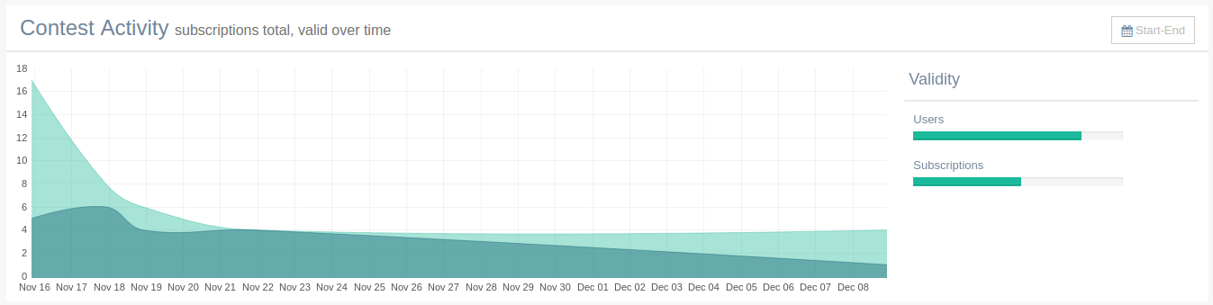
<ga-dashboard-graph-flot graph-title="Contest Activity"
                         graph-sub-title="subscriptions total, valid over time"
                         graph-legend-title="Validity"
                         graph-range="Start-End"
                         graph-data="$ctrl.dashboard.data">
  <div class="col-md-12 col-sm-12 col-xs-6">
    <p>Users</p>
    <ga-progress progress-value="$ctrl.userValidity"></ga-progress>
  </div>
  <div class="col-md-12 col-sm-12 col-xs-6">
    <p>Subscriptions</p>
    <ga-progress progress-value="$ctrl.subscriptionValidity"></ga-progress>
  </div>
</ga-dashboard-graph-flot>